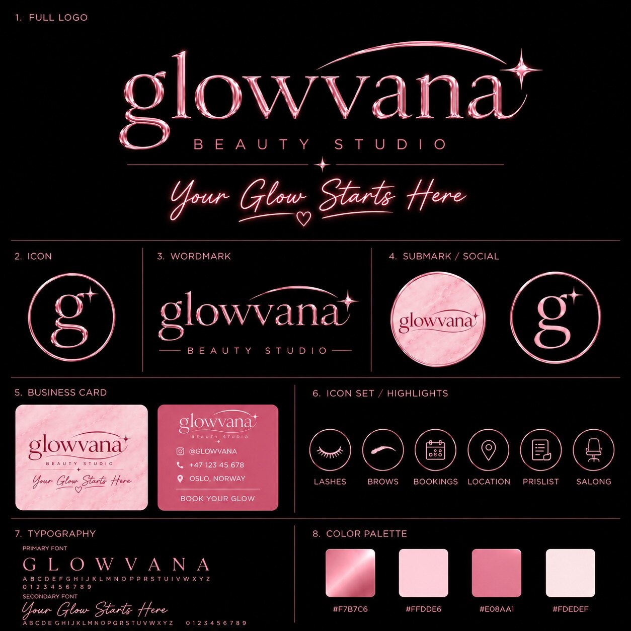
Brand moodboard searches often lead to beautiful grids, templates and colour palettes. Those can be useful references, but a client is not buying a collage. The board has to reduce uncertainty before identity design starts. It should help a team agree on what the brand feels like, what it must avoid and which visual rules can survive beyond one presentation slide.
This guide is for founders, artists and creative teams preparing a visual identity, campaign or rebrand. It shows how to build a brand identity moodboard that can direct real work—without copying another brand or turning one passing aesthetic into the whole strategy.
The real job of a brand moodboard
A strong moodboard creates a shared visual definition. Words such as premium, bold, minimal or futuristic are too broad on their own. One person reads “premium” as quiet editorial typography; another sees gold foil, black marble and dramatic lighting. The board exposes that difference early, when changing direction is still inexpensive.
It should answer five questions:
- What should people feel? Name the emotional response, not only the visual style.
- What should they remember? Identify the shape, material, colour or behaviour that can become recognisable.
- Where must it work? A festival screen, beauty booking page and clothing label demand different levels of detail.
- How should it move? Even a static identity now appears in reels, intros, websites and transitions.
- What is outside the territory? Clear exclusions prevent the direction from expanding into everything.
The result is not a miniature style guide. It is a visual hypothesis: specific enough to guide design, open enough for original work to emerge.
Define the brief before opening Pinterest
Collecting images too early creates a board based on personal taste rather than brand purpose. Start with a one-sentence positioning statement: who the brand is for, what it offers and why the experience should feel different. Then choose three emotional words and translate each into visible evidence.
“Confident” could mean a large typographic scale, direct compositions and deliberate negative space. “Intimate” might mean close crops, warm texture and softer motion. “Unpredictable” could mean asymmetric pacing or one surreal element inside an otherwise controlled system. The translation matters because it turns adjectives into design criteria.
Create a second list called not this. If the brand should feel luxurious but not traditional, futuristic but not sterile, playful but not childish, write it down. Boundaries make the later edit much sharper.
Build the board in five visual layers
Instead of filling one canvas with random images, collect references in five layers. Each layer should contribute a different kind of decision.
1. Composition and space
Look for hierarchy before decoration. Is the direction centred and ceremonial, cropped and energetic, or quiet with large areas of emptiness? Composition determines how the identity will feel on a poster, social asset or homepage before colour and texture are added.
2. Typography and voice
Collect typographic behaviour, not just fonts. Compare narrow or wide proportions, serif tension, letter spacing, capitalisation, number styling and the relationship between headline and supporting copy. A useful board shows how language enters the visual world. It does not need to choose the final typeface yet.
3. Colour and light
Separate base colours from accent behaviour. A dark brand might use black and soft grey as its constant environment, then one violet, red or icy blue signal for moments of emphasis. Also define light: flat, flash-lit, glowing from within, or reflected across a material. Lighting often carries more personality than a long palette.
4. Image, material and texture
Decide whether imagery feels observed, staged, surreal or abstract. Add close material references—brushed metal, wet asphalt, soft powder, scanned paper, glass or grain—only when they support the intended feeling. Texture should give the brand a physical memory, not cover every empty space.
5. Motion and transformation
A modern visual identity moodboard should show time. Include two or three references for pace, transition and reveal: does the world drift, snap, stretch, fracture or assemble? This layer connects the board to an identity that can move instead of treating animation as a later effect.
Use current trends as ingredients, not instructions
Pinterest is valuable because people use it to search, save and organise future intentions. Its 2026 trend forecast highlights directions such as Extra Celestial, Neo Deco, Glitchy Glam and more tactile, expressive aesthetics. The official Pinterest Palette also surfaces Cool Blue, Jade, Plum Noir, Wasabi and Persimmon as colours with momentum.
That does not mean a brand needs a cosmic object, a Deco frame and five forecast colours. A trend belongs on the moodboard only when it strengthens the brief. If “precision with mystery” is the direction, a single celestial lighting reference may help. If “confident heritage” matters, a geometric frame might create structure. Remove any trend reference that could be exchanged for a completely different aesthetic without changing the brand idea.
Recent creative reporting from Adobe points toward sensory, human and culturally specific work as a counterweight to polished sameness. The practical lesson is not to make everything rough. It is to include evidence of authorship: a real material, a local detail, an unusual crop, a custom letterform or motion with a distinctive rhythm.
A moodboard should not prove that you found good images. It should prove that the brand has a visual point of view.
Edit until every reference has a job
More images do not create more clarity. Start wide, then reduce the board until every reference explains a rule that another image does not already cover. A practical final board often needs one dominant image, a small group of supporting references and a short annotation beside each decision.
Use three editing passes:
- Remove duplicates. If five images communicate the same lighting or type treatment, keep the clearest one.
- Remove contradictions. Two references can create useful tension, but not if they imply completely different audiences or quality levels.
- Remove borrowed identity. Do not let one recognisable competitor, artist or campaign dominate the board. Extract the principle and find broader evidence.
Then label the references with the decision they support: “tight crop and direct gaze,” “cold reflection on a neutral base,” or “slow orbital movement.” Annotation turns taste into a usable brief.
Test the direction before approving it
Do not ask, “Do you like this?” Preference alone produces vague feedback. Ask whether the board fits the audience, supports the positioning and can stretch across the required touchpoints. A founder may personally prefer one image while recognising that another direction is more credible for the brand.
Use a simple approval test:
- Can someone describe the direction in one sentence after seeing it?
- Can the team identify what does not belong?
- Does it still feel distinctive with the logo references removed?
- Can it produce both a quiet layout and a high-impact campaign moment?
- Can the motion rule work in one second, five seconds and a seamless loop?
If the board only works as one dense collage, it is not ready. A direction should survive translation.
Turn the approved board into a design brief
The final handoff should include the positioning sentence, three emotional words, three exclusions, the edited board, short annotations and a list of required outputs. Add practical constraints such as existing logo assets, accessibility needs, screen formats, production deadlines and who approves the work.
From there, the designer can build original elements rather than tracing references. The moodboard guides exploration; the identity system decides the actual silhouette, typography, colour ratios, image rules and motion behaviour. That distinction is what keeps inspiration from becoming imitation.
A strong board also creates a better standard for review. Instead of asking whether each design “looks good,” the team can ask whether it expresses the agreed direction and works across the system. That is how the moodboard keeps delivering value after the presentation is closed.