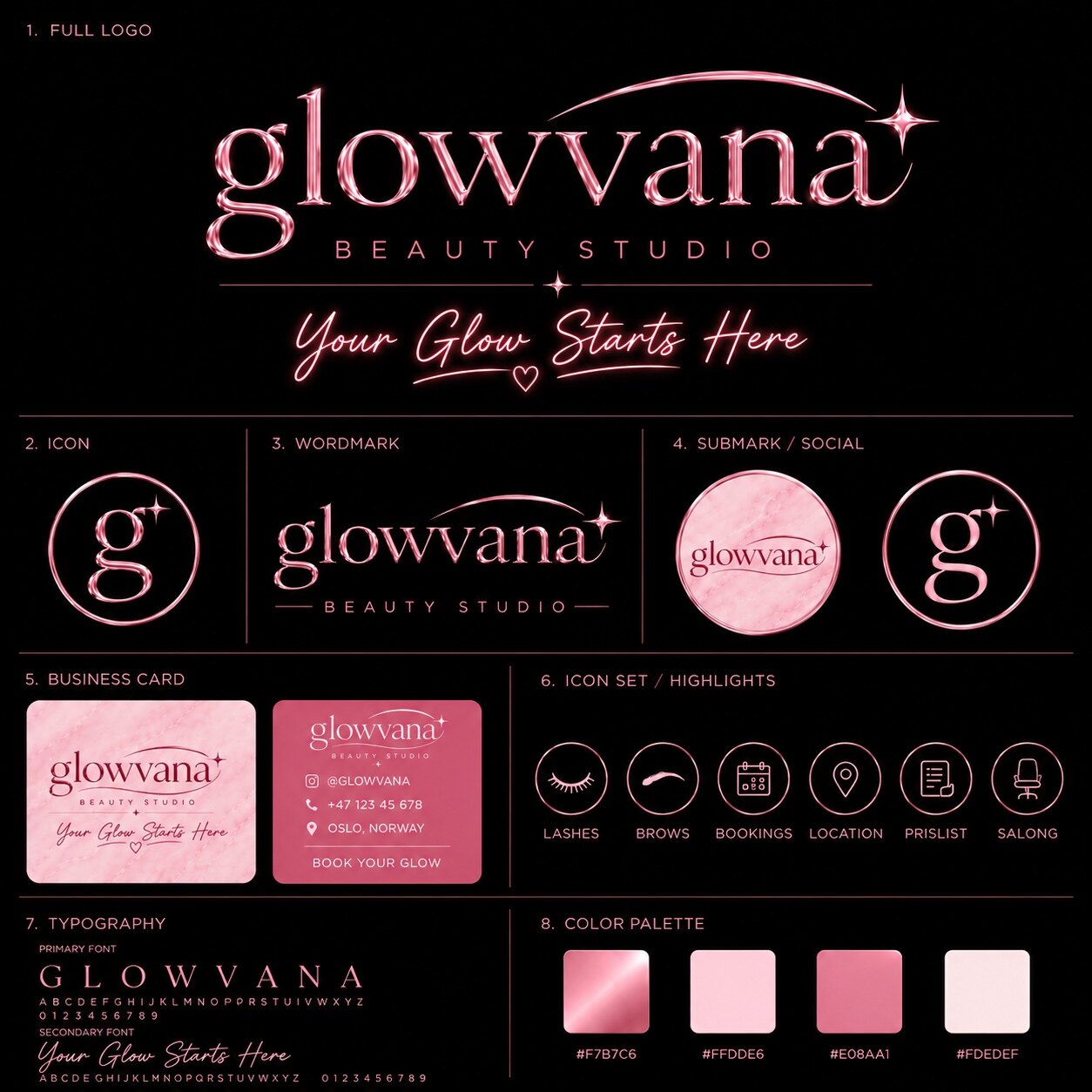
Beauty branding often falls into one of two extremes: so delicate that it becomes anonymous, or so decorative that it loses clarity. Glowvana was built between those poles. Its visual language combines a refined wordmark, metallic pink material cues and a compact icon system so the brand can feel expressive without becoming inconsistent.
Give the wordmark a distinct character
Glowvana’s name invites softness and luminosity, but the design still needs structure. The wordmark uses elegant letterforms and carefully controlled spacing so the shine feels intentional rather than ornamental. A small star detail becomes a repeatable cue instead of a random sparkle.
The supporting line, “Your Glow Starts Here,” introduces a warmer voice while remaining secondary to the main name. The hierarchy allows the identity to speak with both confidence and personality.
Build a recognizable kit, not one logo
The full logo cannot solve every placement. A monogram, submark and circular social version give Glowvana recognizable alternatives when space becomes tight. Each asset shares the same proportions, material mood and visual rhythm.
The palette carries several levels of pink alongside darker neutrals. That range makes it possible to create soft editorial layouts, high-contrast social pieces and practical business materials without abandoning the central identity.
Design the brand for daily use
Business cards and service touchpoints reveal whether a visual identity can organize real information. Glowvana’s applications retain generous spacing and keep decorative effects away from essential details.
The highlight icon set—covering lashes, brows, bookings, location, price list and salon information—extends the identity into the everyday customer journey. Consistent line weight and framing make six different symbols feel like one family.
Create luxury through consistency
Metallic materials can create an immediate premium impression, but finish alone is not a strategy. The identity feels complete because type, iconography, colour and composition repeat the same visual promise.
For beauty brands, the strongest result is usually a small number of recognizable decisions applied with discipline. That gives future photography, campaigns and motion a clear foundation instead of forcing every post to reinvent the brand.