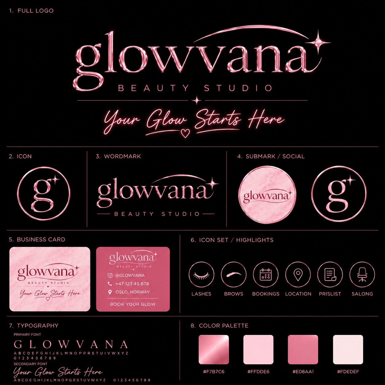
An expensive-looking brand is rarely the one with the most decoration. It is the one that feels deliberate. Its logo, typography, photography, motion and language all seem to come from the same point of view. Nothing looks accidental, and nothing has to shout for attention.
That perception matters because people decide how much they trust, desire and value a brand before they compare specifications. Visual identity cannot replace a good offer, but it changes the frame around the offer. The goal is not to imitate luxury labels. It is to build enough clarity and control that your own brand feels valuable.
Expensive means coherent, not decorated
Premium perception begins with agreement. A restrained wordmark beside chaotic social posts still feels chaotic. Beautiful packaging connected to a generic website still feels generic. Every visible touchpoint teaches the audience what standard to expect, so one weak signal can lower the value of the entire system.
Start by defining three useful qualities your identity must express. “Modern, confident and precise” gives creative decisions a filter. “Luxury” alone does not. When a colour, typeface or effect appears, ask whether it strengthens those three qualities or only adds noise.
The strongest luxury signal is not excess. It is the feeling that every detail survived a decision.
Build one unmistakable core
A recognisable brand needs a centre of gravity. That may be a custom wordmark, a sharp symbol, a distinct photographic treatment or a motion behaviour people begin to associate with you. Pick one leading asset and let the rest of the system support it.
This is where many young brands overbuild. They use five headline fonts, several logo variants, unrelated gradients and a new style for every post. Variety feels productive during creation, but inconsistency makes the audience work too hard. A premium system creates range from a few owned ingredients.
- Lead with one signature. Give the main logo or visual device enough space to become familiar.
- Create controlled variants. Build horizontal, stacked and small-scale marks from the same logic.
- Repeat with intention. Recognition comes from consistent use, not constant reinvention.
Use restraint, hierarchy and space
Space is not emptiness; it is direction. It tells the eye what matters, slows the experience and gives crafted assets room to carry weight. Premium layouts tend to have decisive hierarchy: one dominant message, one supporting thought and a clear next action.
That does not mean every design must be minimal. A maximal identity can still feel expensive when its density is structured. The difference is whether the composition controls your attention or simply fills the frame. Remove anything that competes without contributing.
Treat typography and materials as character
Typography is often the loudest brand voice on the page. Rather than choosing a typeface because it is currently popular, choose it for its posture. A high-contrast serif can feel editorial and sensual. A compact grotesk can feel direct and technical. A custom letterform can turn a familiar name into an owned shape.
Chrome, glass, grain, embossing and 3D can add material presence, but an effect should amplify an idea. Chrome works when reflection, movement and futuristic polish belong to the brand. Used without a reason, it becomes a costume. The premium move is to tune the material—its light, edge, texture and scale—until it feels made for this identity.
Make motion part of the behaviour
Motion reveals confidence. A logo that assembles with a precise rhythm, a page that transitions with controlled weight or a social loop that repeats seamlessly can make a static identity feel alive. The movement should follow the same personality as the design: sharp, fluid, ceremonial, energetic or quiet.
Avoid adding animation to every object. Constant movement reduces emphasis and can make an otherwise refined system feel restless. Choose a few moments where motion changes understanding or creates anticipation, then keep the rest calm. Performance is part of polish; a beautiful effect that stutters is not premium.
Carry the standard into everyday content
A launch campaign can look exceptional and still lose value two weeks later if routine social posts abandon the system. Build templates around the identity’s actual logic: repeat the same spacing ratios, image treatment, type hierarchy and motion rhythm. Templates should protect quality without making every post identical.
Photography and copy matter here as much as graphics. Premium perception falls apart when polished artwork is paired with inconsistent lighting, low-resolution crops or a completely different tone of voice. Create a short brand guide with examples of what to do and what to avoid, then use it as a checkpoint before anything is published.
Show the offer with confidence
Presentation affects how people understand price. Clear product photography, concise descriptions, useful comparisons and an uncomplicated buying path reduce uncertainty. Hiding basic information behind vague language does not create exclusivity; it creates friction. A premium brand can be mysterious in atmosphere while remaining precise about what the customer receives.
A practical premium checklist
- Can someone describe the identity in three specific words?
- Is there one visual asset they could recognise without the brand name?
- Do the website, social posts and sales material look like one world?
- Is the typography intentional at headline, body and mobile sizes?
- Do effects support the concept rather than cover a weak concept?
- Is every important interaction clear, fast and smooth?
A premium identity is not reserved for large companies. It comes from strong decisions, careful execution and the discipline to maintain the system. Build the core first. Add spectacle only where it becomes meaningful.