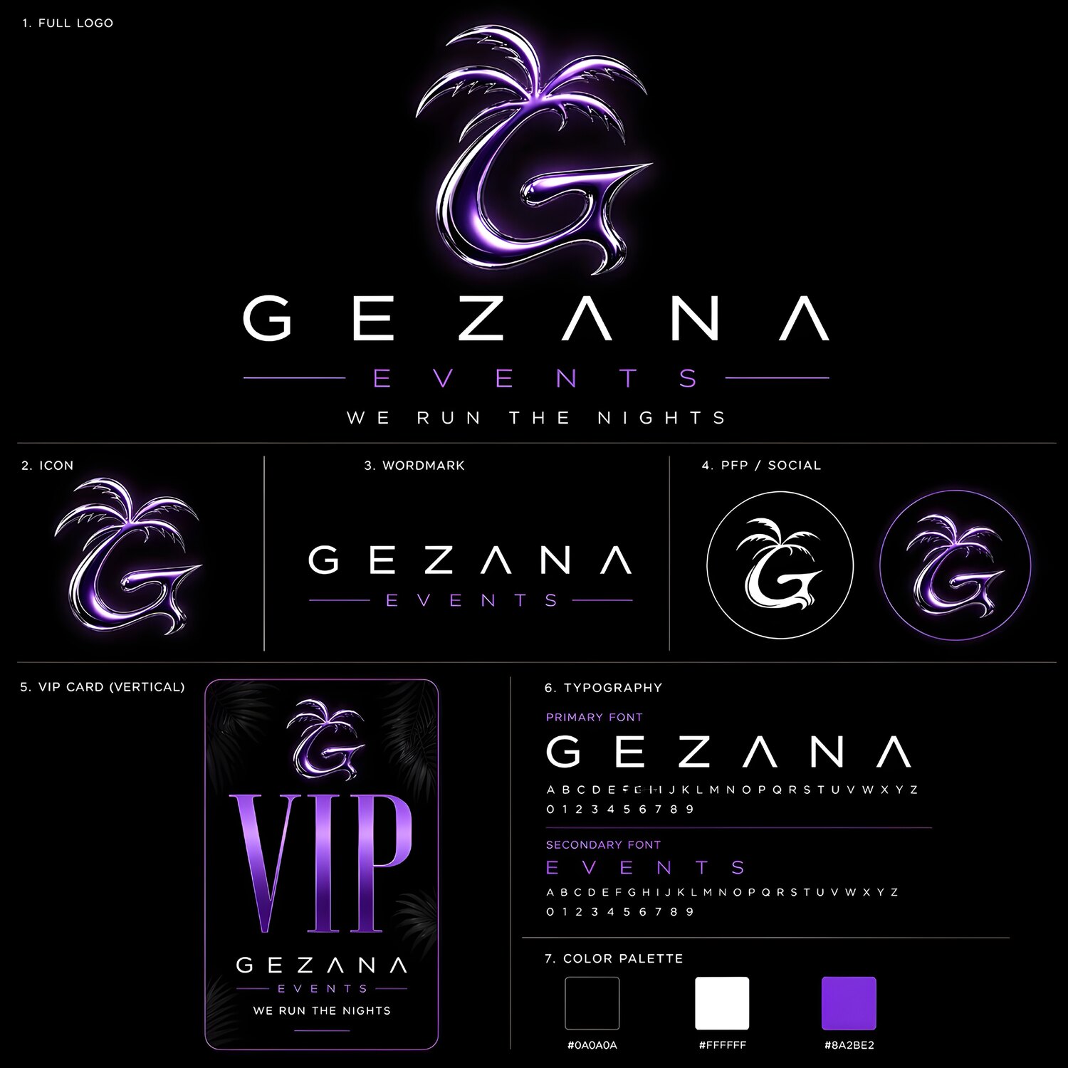
A strong event identity has to do more than look polished in a single presentation. It must remain recognizable on a profile picture, a story announcement, a VIP card, a banner and a moving screen. Gezana Events was approached as a complete visual system: one emotional idea translated into assets that could work across every practical format.
Start with meaning, not decoration
Gezana means home. That gave the identity a useful emotional centre before any typeface, colour or effect was chosen. The palm-leaf cue supports that feeling without turning the mark into a literal illustration. It gives the symbol memory while leaving enough space for the brand to grow.
The central lesson is simple: an identity becomes easier to recognise when every visual decision points back to one clear thought. Instead of stacking unrelated luxury signals, the system asks whether each shape supports welcome, gathering and occasion.
Design one system for many surfaces
Event brands live at radically different sizes. A detailed lockup may work on a YouTube banner and disappear inside an Instagram avatar. Gezana therefore uses a family of related assets: a full logo, compact icon, profile image, watermark and campaign-ready layouts.
The system also accounts for operational pieces such as story and square announcements, a VIP card and promotional formats. These are not afterthoughts. Designing them alongside the identity tests whether the core mark can carry real information without losing its character.
Explore directions, then control the final language
Purple, chrome and black-and-white directions were explored to understand how the identity could shift in mood. Exploration is valuable when it reveals the brand’s range; it becomes noise when every experiment is treated as a separate identity.
The final system needs repeatable rules for contrast, scale, spacing and hierarchy. That control is what lets a brand feel cinematic in one campaign and restrained in another while still reading as Gezana.
What other event brands can carry forward
Begin with a meaning visitors can feel. Build a mark that survives small formats. Test the identity in the actual rhythm of announcements, tickets, screens and social posts. Finally, define enough rules that future content looks connected even when the campaign changes.
A premium identity is not created by adding more effects. It is created when concept, logo, typography, image treatment and motion all behave like parts of the same world.