The most useful logo trends are not instructions to copy. They are evidence of how culture, technology and attention are changing. In 2026, brands need marks that can live as a tiny profile image, a moving screen identity, a physical object and a recognisable shape inside a fast scroll.
That pressure is producing more flexible systems, more custom typography and a renewed interest in material depth. The opportunity is not to collect every trend. It is to find the movement that naturally sharpens your own position.
Identity systems replace the single mark
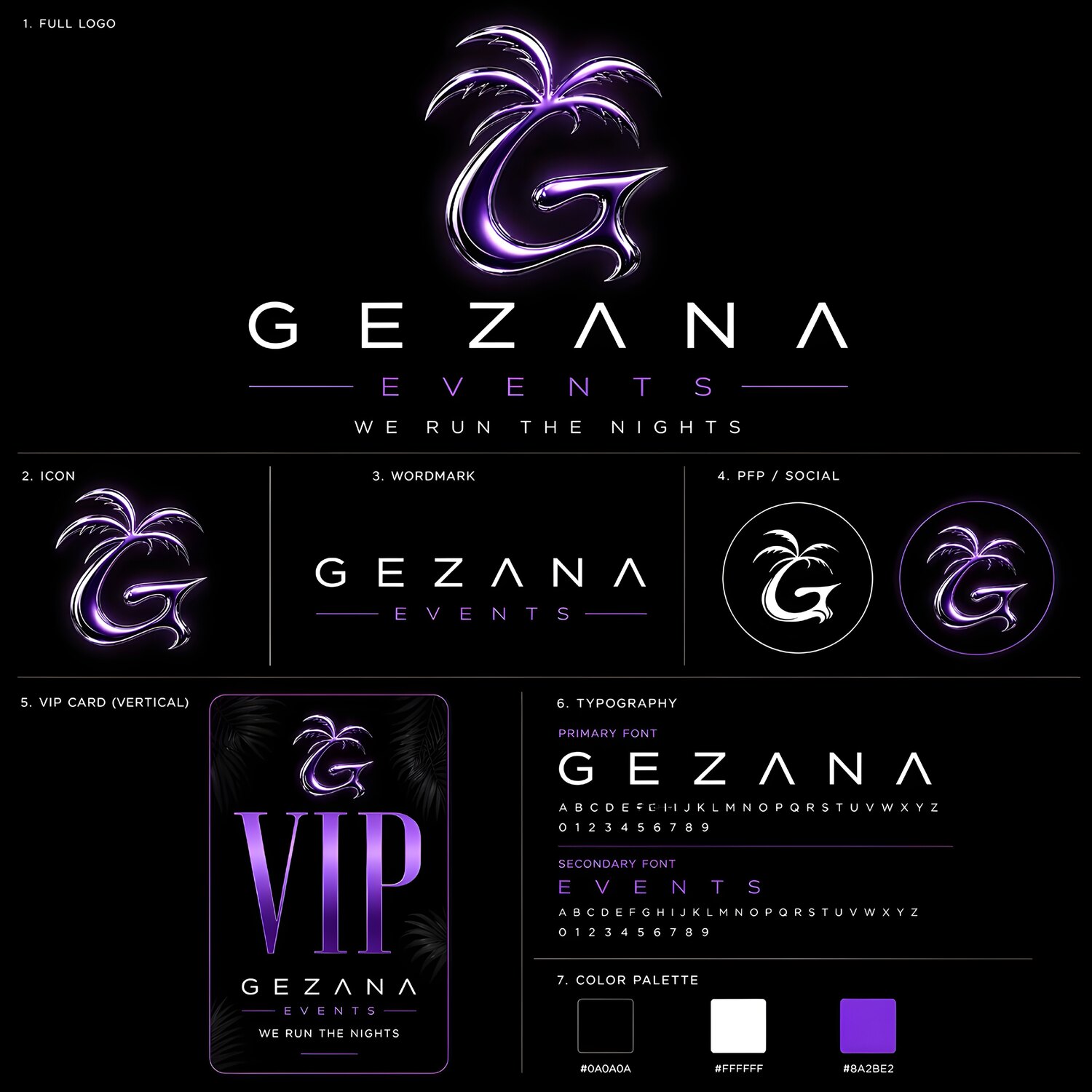
A logo is becoming a family of behaviours rather than one locked file. The strongest identities have a master mark, compact symbols, responsive arrangements and motion rules that stay recognisable across formats. This is especially important for fashion, music, events and digital-first brands whose audiences meet them in many different ratios.
Flexibility should not mean randomness. Each variation needs shared geometry, type logic or movement. If every version looks unrelated, the system loses the repetition that builds memory.
Custom wordmarks with real personality
Generic geometric wordmarks are losing impact because audiences see the same shapes everywhere. Custom letterforms, modified type and unusual spacing create more ownable silhouettes. Small changes can be enough: a cut terminal, a linked pair of letters or a recurring curve can turn a clean wordmark into something proprietary.
The best customisation survives reduction. Test the mark in black and white, at social-avatar size and in one second of motion before committing to delicate details.
A trend gives you a visual vocabulary. Your brand still needs to write its own sentence.
Precision chrome and controlled depth
Chrome remains relevant, but the stronger 2026 version is more controlled. Instead of applying one metallic filter to everything, designers are building believable reflections, edge lighting and material contrast around a simple core. The result feels like an object with weight, not a preset.
Depth is also moving beyond photorealism. Inflated symbols, translucent glass, polished metal and soft industrial forms can make a logo tactile while preserving a clear silhouette. A flat master version is still essential for accessibility, printing and small screens.
Symbols designed to move
Motion is increasingly considered during the sketch, not added after approval. Interlocking pieces can assemble. A stroke can travel through a monogram. A reflective surface can reveal the form as light passes across it. When animation grows from the logo’s construction, it feels inevitable.
This also improves static design. A mark with clear transformation logic usually has a stronger internal structure. The motion becomes another expression of the same idea rather than a separate effect.
Controlled nostalgia: Y2K without costume
Y2K references are evolving from direct imitation into selective borrowing. Curved techno type, orbital symbols, liquid metal and early-digital optimism can still feel fresh when paired with current spacing, cleaner systems and contemporary motion.
Ask what the nostalgic reference communicates. Speed? Rebellion? Futurism? Play? Keep the meaning and redesign the form around the present brand. Copying a familiar era too literally makes the identity expire with the trend cycle.
Micro-marks built for the smallest screen
Profile icons, favicons and app tiles have made the small brand mark strategically important. Dense emblems are being complemented by simple monograms and symbols with generous negative space. The micro-mark is not a watered-down logo; it is a purpose-built member of the identity.
Test it against real interfaces. A symbol that looks perfect on an artboard may disappear beside other avatars or lose its edge inside a circular crop.
Distinctiveness in an age of instant generation
As automated tools make polished symbols easier to produce, basic competence is no longer enough to feel distinctive. Brands will need stronger concept choices and more specific craft. A logo should connect to a name, story, product or audience in a way that a generic prompt would not naturally invent.
Save the sketch logic and define why each feature exists. That explanation helps a team use the identity consistently and makes it easier to judge future variations. It also separates a designed system from a fashionable image that cannot extend beyond one mockup.
Accessibility and ownership still matter
Check legibility, colour contrast and the ability to reproduce the identity without reflective or animated effects. Search for confusingly similar marks in the relevant market and get appropriate legal advice before a major launch. Visual originality and legal availability are different questions; a professional process considers both.
How to choose a trend without becoming trendy
- Start with the audience and the feeling the brand must own.
- Select one trend that strengthens that feeling, not five that look impressive.
- Translate it through custom geometry, type or material treatment.
- Build flat, dimensional, compact and motion-ready versions.
- Test every version in the real places the brand will appear.
The strongest 2026 logos will not be the ones that look most current on launch day. They will use current tools to create a distinctive shape, then rely on a coherent system to remain recognisable after the visual mood changes.