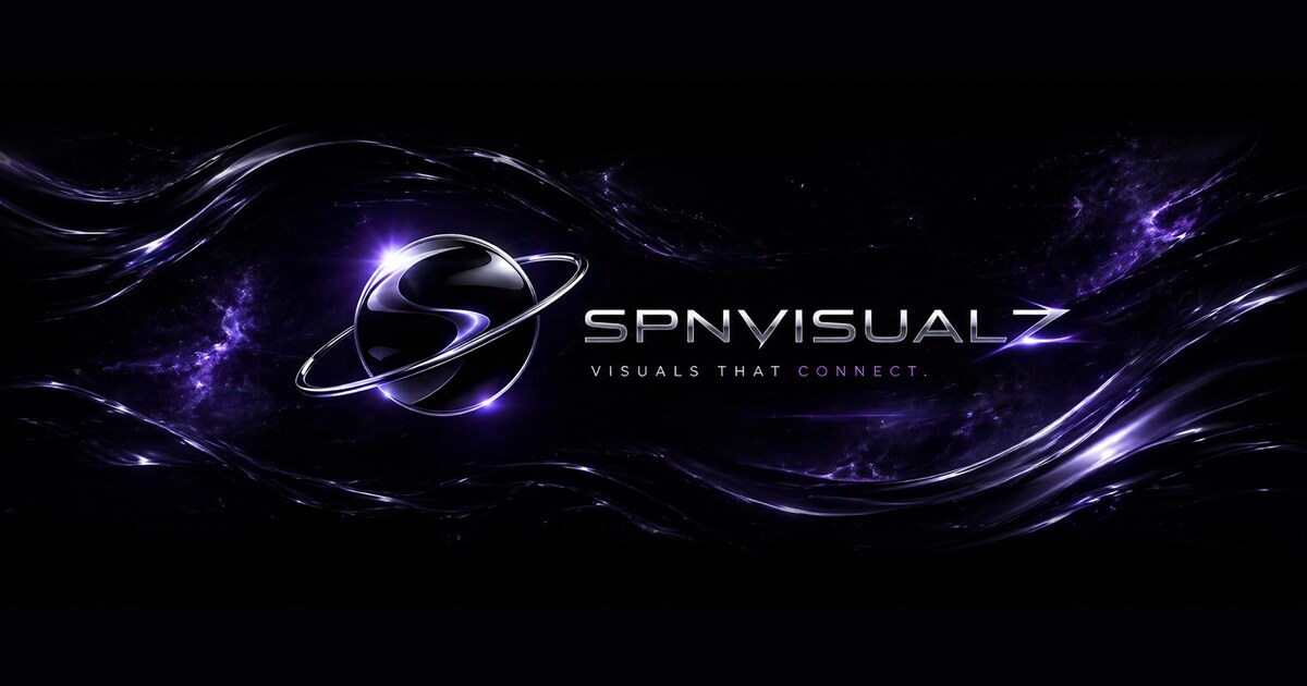
Search intent around 3D logo design has shifted from “make it look futuristic” to a more useful question: how can a logo gain depth without becoming impossible to reproduce? That is the right question. A 3D logo is not a separate identity. It is a performance of the identity under a chosen material, light and camera.
The distinction matters because dimensional work is now everywhere: chrome wordmarks, glass icons, liquid type, inflated lettering and dark cosmic scenes. Pinterest’s 2026 palette is also pushing deep, dramatic colour—especially Plum Noir—alongside sharper accent shades. The opportunity is not to copy the surface. It is to use depth as a controlled extension of a mark that already works without effects.
Why 3D works when the brand idea is already clear
Depth adds three things that a flat mark cannot: a sense of presence, a stronger relationship with light and a more cinematic entrance into motion. It can make a logo feel like an object with weight, not just a shape on a page. But it cannot solve a weak silhouette, a confusing name or an inconsistent brand system.
Our first rule is simple: if the mark is not recognisable in one colour at small size, do not start with materials. Start with the silhouette. A useful 3D pass should make the existing idea easier to remember. It should not force the viewer to decode reflections before they know what they are looking at.
Build the flat mark first
Before chrome, bevels or camera moves, test the logo in four flat states:
- One-colour: does the silhouette hold without contrast tricks?
- Small-size: does the mark survive as a profile image, favicon or social avatar?
- Reverse: can it work in light-on-dark and dark-on-light?
- Single-line: can the core construction be explained without the render?
This is the same discipline behind a strong motion-ready logo system. The static mark carries recognition; the motion version carries timing and attitude. If the 3D treatment is doing all the recognition work, the identity is too dependent on the effect.
Choose one material behaviour
Premium results usually come from one material behaving consistently, not from layering every finish at once. Chrome is useful because it mirrors light and can make the mark feel engineered. Glass is useful when transparency and refraction are part of the brand idea. Soft inflated forms can work for beauty, fashion or playful culture. A black ceramic or obsidian treatment can create weight without shouting.
The material should answer a brand question. For example: is the identity meant to feel precise, nocturnal, soft, industrial, collectible or high-energy? “Chrome because it looks cool” is not art direction. “Chrome because the mark is built around reflection, polish and performance” is a usable decision.
For SPNVISUALZ, that is why black, chrome and violet-black work together: the neutral base protects legibility while the reflective highlight gives the identity a moving signal. The same principle appears in our TAO black-and-chrome motion world.
Light with intent
Lighting is where many 3D logos become generic. A random purple glow can make any mark look “futuristic” for a second, but it does not create a recognisable world. Use light to reveal construction:
- Use a key light to describe the main plane or edge.
- Use a restrained rim light to separate the silhouette from the background.
- Keep the brightest highlight near the part of the mark you want the eye to remember.
- Leave some areas dark. A logo with no shadow has no weight.
Current visual culture is rewarding richer, more atmospheric palettes rather than flat neon overload. Pinterest’s official 2026 palette is a useful prompt here: Plum Noir can deepen a black world without turning it muddy, while Cool Blue or Wasabi can work as rare signals rather than full-page fills. Use trends as calibration, not as a costume.
Give motion a grammar
Motion should explain how the object exists. A slow orbit can establish volume. A sharp light sweep can introduce the material. A controlled push-in can make the mark arrive. A loop can hold attention without requiring a new idea every second.
Pick one or two recurring rules:
- Arrival: the logo enters from darkness or resolves from fragments.
- Reveal: the key highlight crosses the mark in a repeatable direction.
- Hold: the object breathes, rotates or drifts without losing its silhouette.
- Exit: the same material breaks, fades or recedes in a way that can be reused.
This creates what I call a motion grammar: a small set of behaviours that can extend into intros, loops, social posts and website moments. It is more valuable than one spectacular animation because it lets the identity keep speaking after the hero scene is over.
Use the format test before you polish
A 3D logo is not finished when the hero render looks beautiful. Test the same identity in:
- one-colour SVG or PNG;
- small social avatar;
- transparent overlay on video;
- dark website hero;
- vertical 9:16 story frame;
- wide 16:9 title card;
- still print or poster crop.
If the mark only works in the wide hero, you have made a scene, not a system. That can still be useful—but it should be labelled honestly and priced as a motion asset, not sold as a complete identity.
The strongest 3D logo design is therefore not the most complicated one. It is the one that gives the viewer a clear shape, a believable material and a memorable movement pattern—then survives when the effects are removed. That is how a visual world becomes a brand.
Related Visual Lab files
Continue with Logo Design Trends 2026, Dark Website Design Inspiration or the guide to making a brand look expensive.